Bringing a Brand to Life
REFRONTOLAND
The Creation of the Refrontoland Brand
The Challenge: Translating Values into Design
The first step in the creative process was to deeply understand Refrontoland’s philosophy. Their commitment to sustainability, environmental education, and community well-being needed to be clearly reflected in the logo and visual identity. I began with a series of meetings and brainstorming sessions with the Refrontoland team to capture the nuances of their message and expectations for the brand.
The Creative Process
For the logo, the goal was to create a symbol that was simple yet powerful, capable of conveying Refrontoland’s values at a glance. After several iterations, I opted for a design that incorporates natural elements, representing the connection with the earth and the environment. The clean lines and organic shapes evoke a sense of balance and harmony, key elements of Refrontoland’s philosophy.
Color selection was another crucial aspect. I chose a palette of three colors: Wine Red to represent the culinary aspect and good taste, Green to symbolize the connection with nature and serenity, and Pale Yellow to represent white wines, elegance, and refinement. These colors not only strengthen the bond with the environment but also convey tranquility and trust, values that Refrontoland seeks to instill in its followers and participants.
Brand Identity
In addition to the logo, the brand identity includes various coordinated visual elements to ensure consistency across all communication channels. This encompasses typography, colors, images, marketing material layouts, and templates for the website and social media.
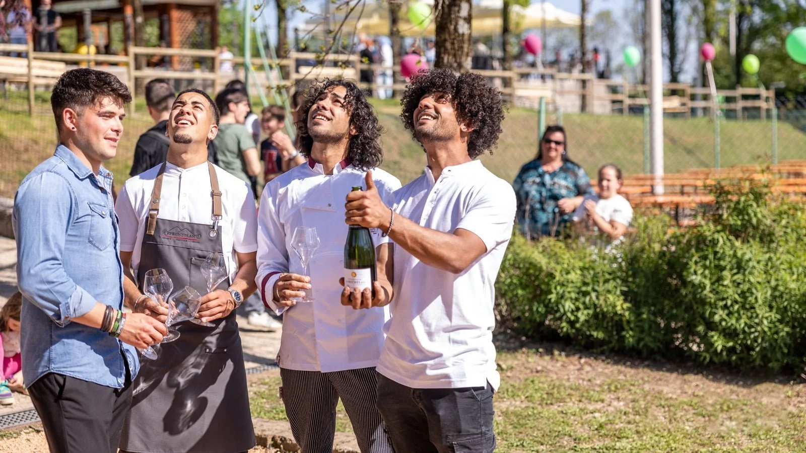
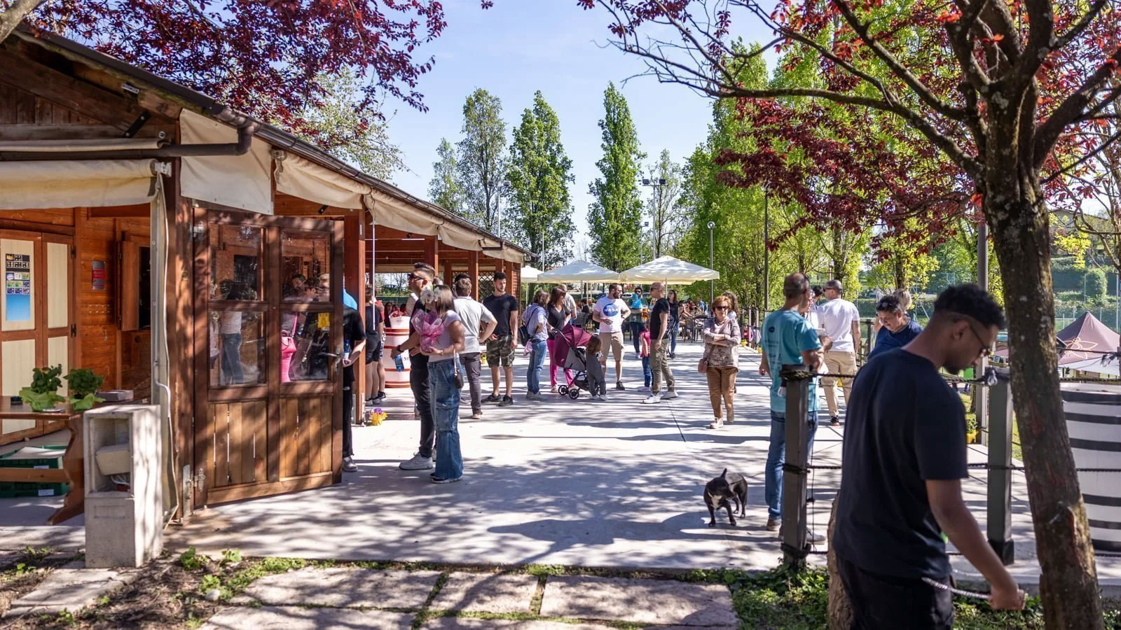
For typography, I selected modern yet accessible fonts that reflect Refrontoland’s contemporary approach while retaining a sense of warmth and inclusivity. The images chosen for the brand are authentic and depict everyday life, nature, and community scenes, emphasizing the deep connection Refrontoland has with its audience.
The Impact of Design
The new logo and brand identity had an immediate and positive impact. The design received enthusiastic feedback from the Refrontoland team and their supporters. The visual consistency helped reinforce brand recognition, facilitating more effective communication of their values and mission.
Conclusion
Working with Refrontoland was an enriching experience. Not only did I have the opportunity to contribute to an important cause, but I also applied and refined my design skills on a meaningful project. The creation of the logo and brand identity for Refrontoland is an example of how design can go beyond aesthetics, becoming a powerful tool for communication and emotional connection.
I am proud of the work done and the trust Refrontoland placed in me. Continuing to follow and support their journey will undoubtedly be a constant source of inspiration. If you want to learn more about Refrontoland and their initiatives, visit their website here.
